

What a pricing page design has to do
A pricing page design has to do three things for a SaaS buyer: reduce uncertainty, make the upgrade path obvious, and route enterprise buyers to sales.
Your pricing page design must give SaaS buyers a clear overview of what you offer and who each pricing tier is for. This reduces uncertainty and, by articulating who each pricing tier is for, makes the upgrade path obvious.
Many enterprise SaaS buyers have complex needs that require specialized solutions. You should route these buyers to sales with a questionnaire, form, or address. Doing so lets you understand their needs and provide them with the appropriate solution.
Tier structure: how many plans and how to name them
Just about every SaaS pricing page relies on some kind of tier structure. Every tier, within a SaaS pricing page, comes with specific features, services, and benefits.
If a SaaS buyer is looking for a specific set of features, they need to know which tier encompasses those features. But, that’s not all: they also need to know the other features you offer and how those features will benefit them.
Here are two SaaS pricing page examples of tier structures. One is from the Instantly.AI pricing page and the other is from the Webflow pricing page:
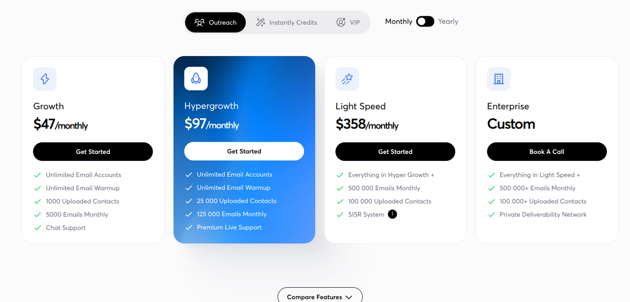
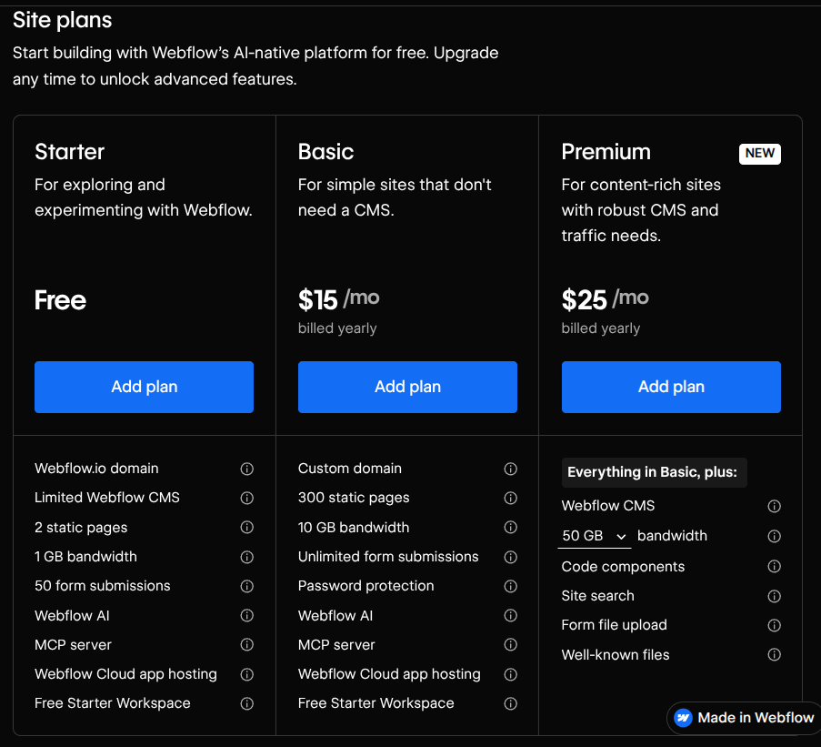
Instantly.AI’s pricing page comes with four tiers. Webflow’s pricing page comes with three tiers. Each tier is defined by what it offers, a monthly price, and the needs they satisfy.
If you look at the Instantly.AI tier structure, you will see that the “Growth” plan gives people access to “Unlimited Email Accounts” and “Unlimited Email Warmup.” But, includes strict limits on contacts and monthly emails.
If you look at the Webflow tier structure, you will see that “Starter” is “For exploring and experimenting with Webflow.” This tier includes strict limits on the domain, CMS, number of pages, and overall bandwidth.
Both of these tiers are less expensive than the other tiers and both satisfy the needs of specific clientele. But, the other tiers encompass more features because they are for buyers with different needs.
The other tiers come with different names. For Instantly.AI, these names reflect the growth goals of a particular client. For Webflow, each tier name is a size-based name: it reflects the number of features a particular plan offers.
Both naming structures are in contrast to a persona-based name, which is a tier name that reflects the person who may need the features offered within a particular tier.
If you look at the final tier, for both of these sites, you will see that they encompass all of the features in the previous tier, as well as a set of new features. This is an example of the “everything in the previous tier plus” pattern.
When developing your SaaS pricing page, you need to think about how many plans you need and how to name them. And, to do this, you should think about the following:
- Try to reduce complexity by keeping the number of tiers to around three or four. Too many tiers can make it difficult for buyers to determine if you offer what they need.
- If you have a specific user in mind, for each tier, use persona-based naming to name each tier around that user.
- If you are offering a service that is for a more general audience, use size-based naming to reflect the number of features each tier offers.
Monthly and annual toggles
A pricing toggle is a switch that lets SaaS buyers choose from two types of pricing plans: monthly and annual. If a buyer clicks on the “Monthly” toggle, they can see the prices you offer for monthly users. If a buyer clicks on the “Annual” toggle, they can see the prices you offer for annual users.
This section's example is pulled from “Delphi.AI.” Here are two screenshots of Delphi.AI’s tier structure and pricing toggle:
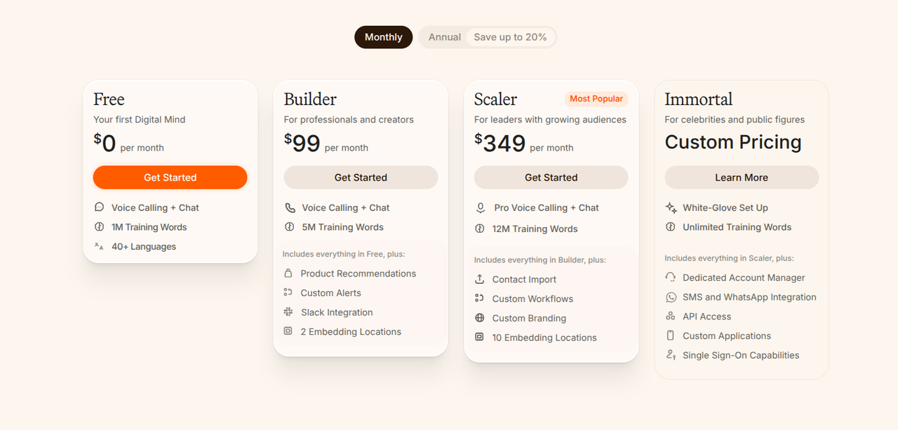
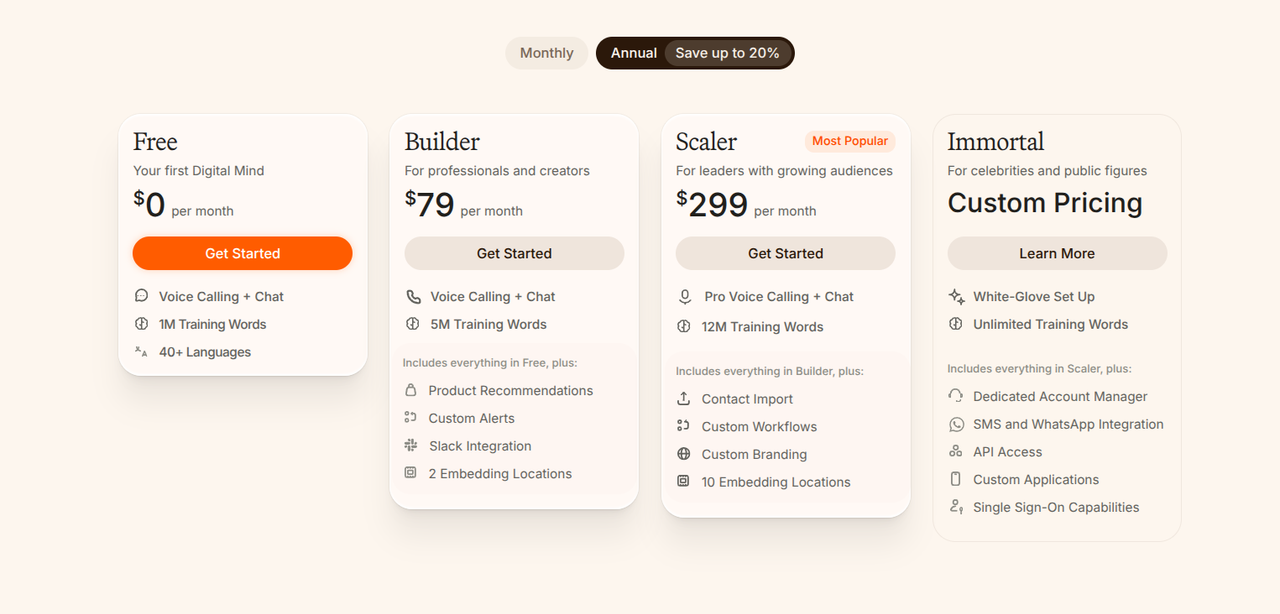
The left is after the “Monthly” pricing plans have been toggled. The right is after the “Annual” pricing plans have been toggled.
Here are three things to keep in mind about implementing a pricing toggle in your SaaS pricing page design:
- The pricing toggle is placed right above the tiers. This makes it easy for SaaS buyers to see the tiers you offer and their monthly/annual cost. Placing them elsewhere can make it hard for buyers to access this information.
- The discount is displayed in two ways: there is a “Save up to 20%” caption within the “Annual” toggle and, upon clicking the “Annual” toggle, you can immediately see that the monthly prices go down by a significant amount. This highlights the costs-savings that come with an annual subscription.
- The prices automatically grow/lower, depending on which toggle you activate. If you are on the “Monthly” toggle, clicking “Annual” will show the prices lowering. But, if you are on the “Annual” toggle, you will see the prices grow. This makes it easier to steer buyers towards the annual package.
For your own monthly and annual toggles, you may want to do the following:
- Place your pricing toggle directly above your pricing tiers.
- Start under the “Annual” tier so that, upon selecting the “Monthly” tiers, buyers will see the price increase.
- Highlight the cost savings with a specific percentage, such as “Annual (25% Less.)”
Before concluding this section, here is a Webflow note on how to design a pricing page toggle with interactions or a component variant:
- If you want a reusable toggle that changes the visual state of your pricing page design - you go from “Monthly” to “Annual” text with just one click, for example - you should use component variants.
- If you want to visually hide and depict different pricing cards, images, or animations, all on the same page, you should use Webflow Interactions.
Anchoring and the recommended plan
The best SaaS pricing page designs guide buyers towards a particular plan by anchoring that plan with specific design choices.
Here is one example of a highlighted middle tier from Statamic:
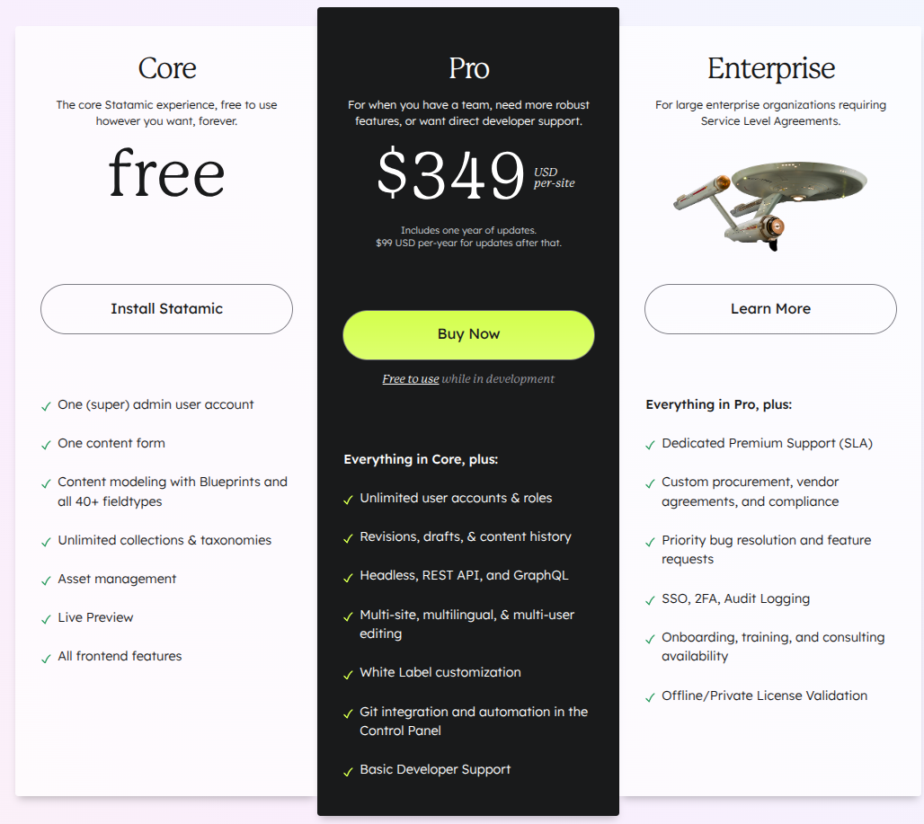
This highlighted middle tier steers SaaS buyers towards that particular choice by doing the following:
- Giving buyers a clear price/numerical value, unlike the two other tiers.
- Using a bold black color for the tier, which is in contrast to the muted white color of the tiers to the side.
- Relying on a larger frame that dwarfs the two frames to the left/right.
- Giving buyers the option to “Buy Now,” with a bold yellow button that stands out in the black background.
Here is one example of a badge from Cap:
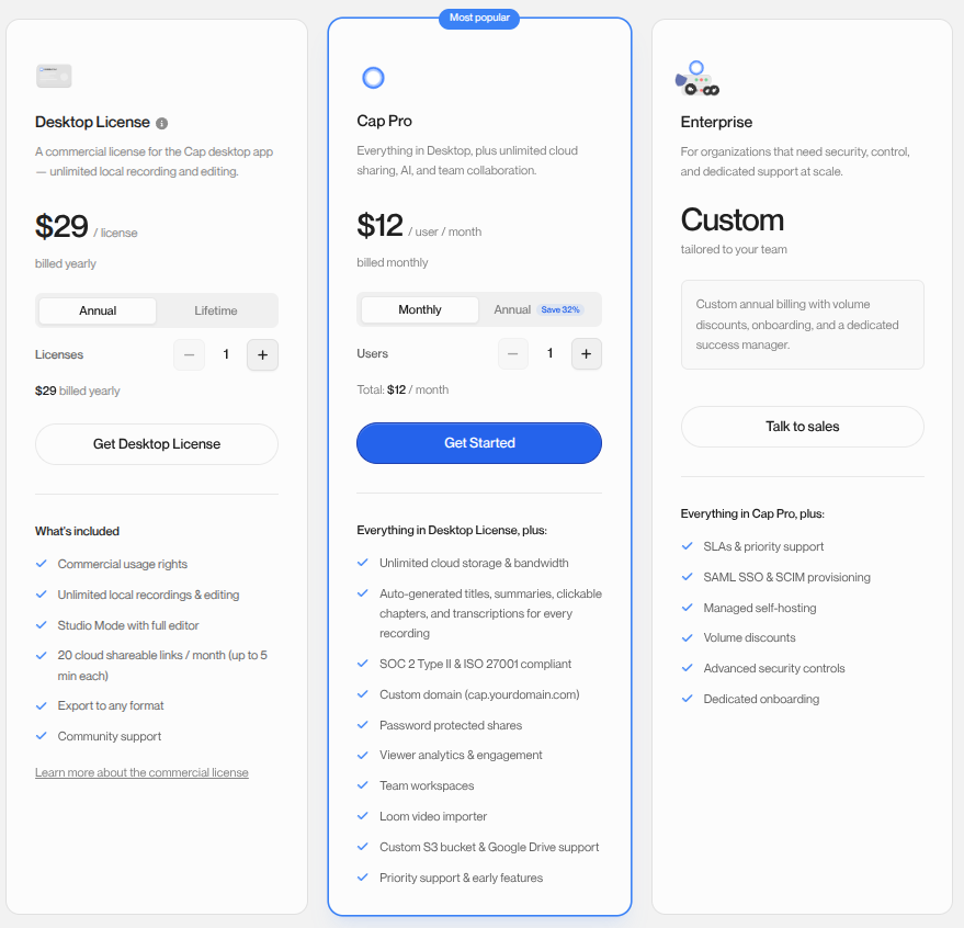
This badge steers SaaS buyers towards the choice by doing the following:
- Telling buyers that a particular pricing tier is the “Most popular” choice.
- Framing this pricing tier within a blue highlight, which helps to steer your eyes towards it.
- Giving you a longer list of features, in comparison to the two other tiers.
You can implement these two design ideas, within your own pricing page design, by:
- Using bold colors, a larger frame that dwarfs the frames of the other tiers, and big text to guide buyers toward your recommended pricing tier.
- Placing your recommended tier within the middle of the frame, so that buyers are drawn to it.
- Giving your buyers a large, colorful button that says “Buy Now,” so that they can access that tier with ease.
- Setting up a badge for that particular tier and naming this badge something like “Best value” or “Most popular.”
Enterprise and 'contact sales' CTAs
Many SaaS pricing pages contain tiers with no public price. These tiers are often for enterprise buyers with specialized needs that a one-size-fits-all price cannot address. Here is an example of this from Tavus:
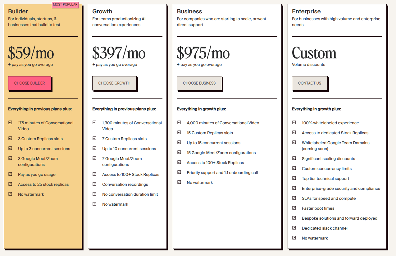
If you take a look at this tier, you will notice the “Contact Us” button. This is a call-to-action that is meant to put SaaS buyers in touch with a real person who can help them with the enterprise-level problems they are facing.
You can develop more elaborate copy for your call-to-action. But, “Contact Us” is often sufficient. And, in the example above, clicking on “Contact Us” brings buyers to a form page, which you can find below:
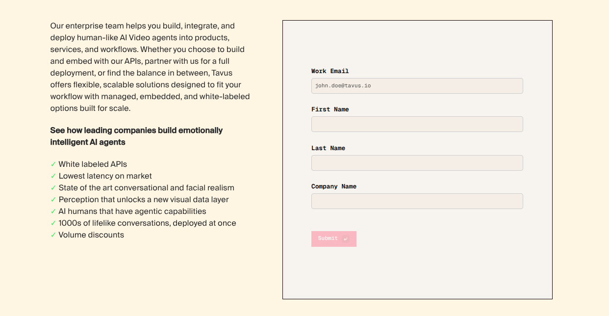
The form page is quick and easy. Right next to the form page is a new piece of copy that further highlights what the enterprise pricing tier has to offer enterprise users. This copy would not fit in the pricing tier, but it is useful for enterprise buyers who want to learn a little bit more before reaching out for more information.
Just below the “Contact Us” button, within the “Enterprise” pricing tier, is a long list of features. This list mentions that all of the features, in the prior tiers, are present. Then, it highlights all of the enterprise-specific features this tier includes. Doing this saves time, as enterprise buyers want to know what, specifically, you offer for them.
If you plan on having a pricing tier with no public price, you should keep the following in mind:
- Give enterprise buyers a button that lets them contact you and make sure this button is inside of the pricing tier. Putting an email address, steps to follow, or a phone number is far less intuitive and may make enterprise buyers less interested in contacting you.
- Highlight the specific enterprise features your enterprise pricing tier offers. If applicable, mention that this pricing tier includes features from the other tiers; but don’t list all of those features, as enterprise buyers only want to know the enterprise-specific features you offer that will help them achieve their goals.
- Make sure your contact button has an actionable name, such as “Contact Us” or “Learn More.” And, make sure that buyers, upon clicking this button, are brought to a form that facilitates this contact. If it leads to a page without a clear form or any clear means of contact, buyers may close the page.
Webflow has its own form routing system and, because of this, the following needs to be kept in mind:
- If you need real-time routing for your contact form, you may want to embed a HubSpot Form into the contact page. Webflow forms do not always support real-time routing.
- You can use Salesforce’s Lead Assignment Rules to assign the lead you receive, from your HubSpot Form, to the correct member of your team.
- If you want to schedule a conversation with buyers, you can use the two systems above and set them up so that they lead to a Calendly link. This lets buyers set aside a time to speak with a member of your team.
Comparison tables that do not overwhelm
A core element of most SaaS pricing page designs is the comparison table. Your comparison table must give SaaS buyers a clear overview of the features that each pricing tier offers and it must give them this information without overwhelming them.
The sticky header table is one way to develop comparison tables that do not overwhelm. Here is one example of a sticky header table from Loom:
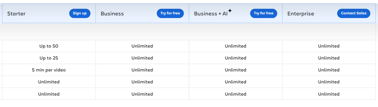
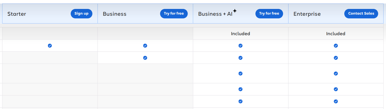
You’ll notice that there are two screenshots. This is because a sticky header table is a table that delineates the names of each pricing tier while “sticking” to the screen as you scroll.
If a buyer is interested in looking at your pricing tiers, they can scroll through your features list and, in doing so, the table with the names of each tier will be just above the tier, at all times, until they reach the end.
This makes it much easier for buyers to understand the features they are looking at and which tier offers those features. Not having a sticky header table could lead to buyers scrolling and forgetting which tier has which features.
When it comes to making comparison tables that do not overwhelm, you should make use of grouping, tooltips, and mobile behavior best practices. Doing this can allow you to develop a simple, concise, and easy-to-understand comparison label, much like the one in our example. Some of these best practices are as follows:
- Grouping: Display the tier names within the headings that make up your sticky header table. Make sure these tier names are always visible while scrolling through the features encompassed within each tier. Within each heading, include a small call-to-action button, such as “Contact Us” or “Sign Up Today.”
- Tooltips: Use “hover-to-reveal” for desktop devices and “click-to-reveal” for mobile devices. Do your best to make things tactile and easy to interact with. If mobile users have to hunt for a button, they might not be able to access the information you wish to convey with tooltips.
- Mobile behavior: Many SaaS pricing layouts cannot properly display on mobile devices. You can fix this by giving mobile users a drop-down that lets them select the tier they wish to view. Or, by giving them each column and letting them swipe to the next one.
Before moving onto the next section, here is a Webflow note on CMS-driven feature tables: Webflow greatly restricts the ways in which you can nest dynamic data. This means that HTML table tags aren’t always useful for comparison tables. Instead, you may want to use the Webflow Div structure with either CSS Grid or Flexbox.
FAQ, proof and the last objections
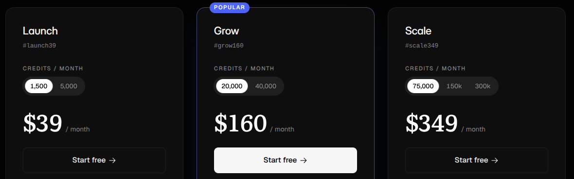
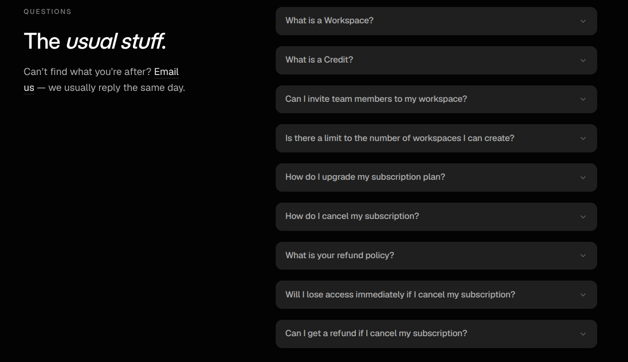
Even if buyers are interested in your B2B SaaS service, there’s a good chance they have questions. They could reach out to you for answers, but it would be a lot easier if these answers were on the pricing page. This is where an FAQ comes in: giving potential buyers quick, concise, and simple answers to the questions they may have.
The two screenshots at the top of this section are from OrShot. You can see the pricing tiers and, then, below these tiers and their respective comparison tables, an “FAQ” section.
Your FAQ section should be placed within the same page as the pricing tiers and comparison tables. Most SaaS pricing page designs place the FAQ right underneath the pricing tiers and comparison tables. The best pricing page designs include an FAQ.
Putting your FAQ on another page can dissuade buyers, as they may not be able to find the FAQ with ease. Not having an FAQ may also dissuade buyers, as they might not want to reach out for answers to simple questions.
Right within your FAQ, you should answer questions related to the following:
- Features: The features you offer and what those features do, as well as the overall value these features offer.
- Pricing: How your pricing works, if buyers can switch plans, and if you offer volume/enterprise discounts.
- Security: Where you store your data, the security certifications you have, and who owns your data.
- Integration: The tools you integrate with, if you have an API, and the duration it takes for onboarding.
- Support: The support you offer, how often you update your services, and support channels they can use.
To further highlight your value, you can place social proof near the CTAs. Some ways to do this are as follows:
- Display security seals, such as “SOC 2” compliant.
- Present statistics, such as “50,000 enterprise users.”
- Share a review score from a trusted software directory, such as Capterra.
- Give buyers a trust-building guarantee, such as “No credit card needed.”
- Show micro-testimonials, with one or two sentences, from recognized clients.
Building these patterns in Webflow
To build a SaaS pricing page in Webflow, you can rely on native patterns. Here are the most notable B2B SaaS pricing page patterns that are native to Webflow:
- Pricing card layouts with multi-tier grids, badges, and featured checkmark lists.
- Monthly/annual toggle switches that change the pricing plans after being clicked.
- Currency symbols that change manually, depending on which currency symbol is selected.
- Dropdown/accordion FAQ menus.
On top of that, Webflow lets you manage plan names, descriptions, prices, and CTA links through the CMS. This lets you update the copy without having to edit the layout.
Even though Webflow supports a variety of different SaaS pricing page patterns within its native ecosystem, there are also a number of patterns that require custom code:
- Interactive sliders that adjust the price and/or features you offer when the slider is dragged in a certain direction.
- Nested feature comparison matrices that include interactive tooltips, sticky header tables, and dynamic mobile horizontal scrolling.
- Automatic multi-currency conversion that looks at a buyer's current IP to determine the currency they are using and adjusts the pricing page to accommodate this information.
Developing a B2B SaaS pricing page can be complicated. Teams can get stuck on implementing custom code within Webflow’s ecosystem or making use of Webflow’s native pricing page features:
- The annual/monthly toggle: Developing a proper annual/monthly toggle often requires custom code or complex interactions that can be difficult to set up.
- Setting up clean comparison tables: Making clean comparison tables is essential, but getting them to look clean on desktop and mobile devices can be very difficult.
- Pricing tier hardcoding: You can hardcode your pricing tiers into the site or put them into the Webflow CMS. Both can make your website’s code more complex and make it harder to update the copy.
Wrapping it up
Developing an effective B2B SaaS pricing page through Webflow can be difficult. If you use the patterns, ideas, and information above, though, it will be a lot easier.

